Piraquê
Este projeto foi desenvolvido durante o período em que Mike Câmara atuava como Diretor de Criação na agência 100% Design.

The strength of consistency
Born in 1950, one of the most traditional food industries in the country rescues uniqueness and builds the visibility needed to expand your business.

Briefing
Evolve with Piraquê's identity to improve brand awareness at the POS and leave a legacy for other lines. After many years building a large portfolio and following the habits of consumers, it was detected that it was time to review the essence and purpose of Piraquê and transmit it in a clear and objective way, both in its institutional version and in the entire architecture of packaging.
Strategy
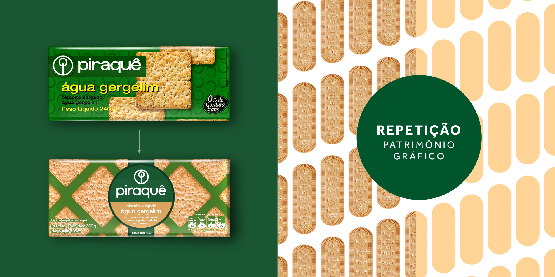
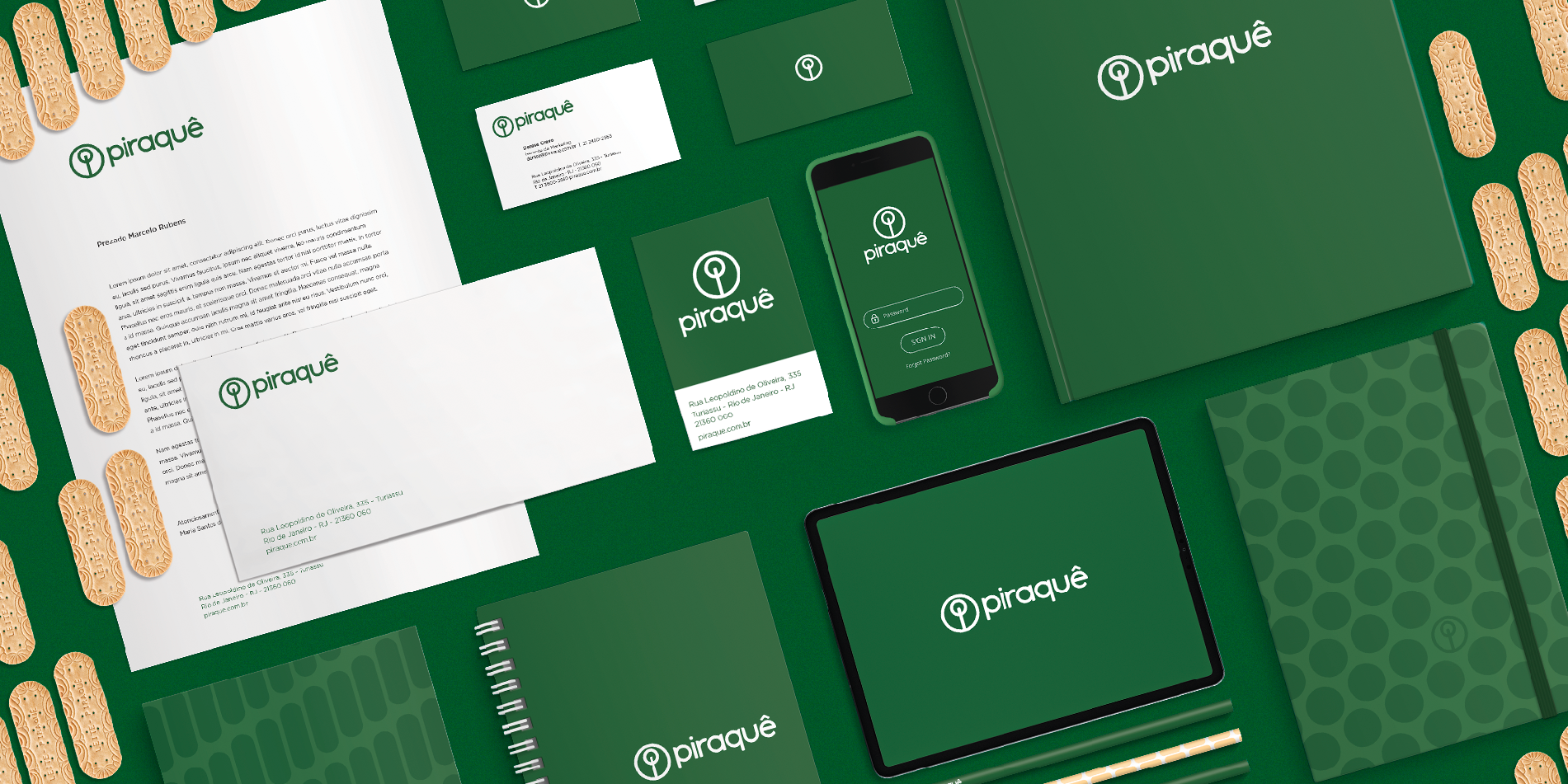
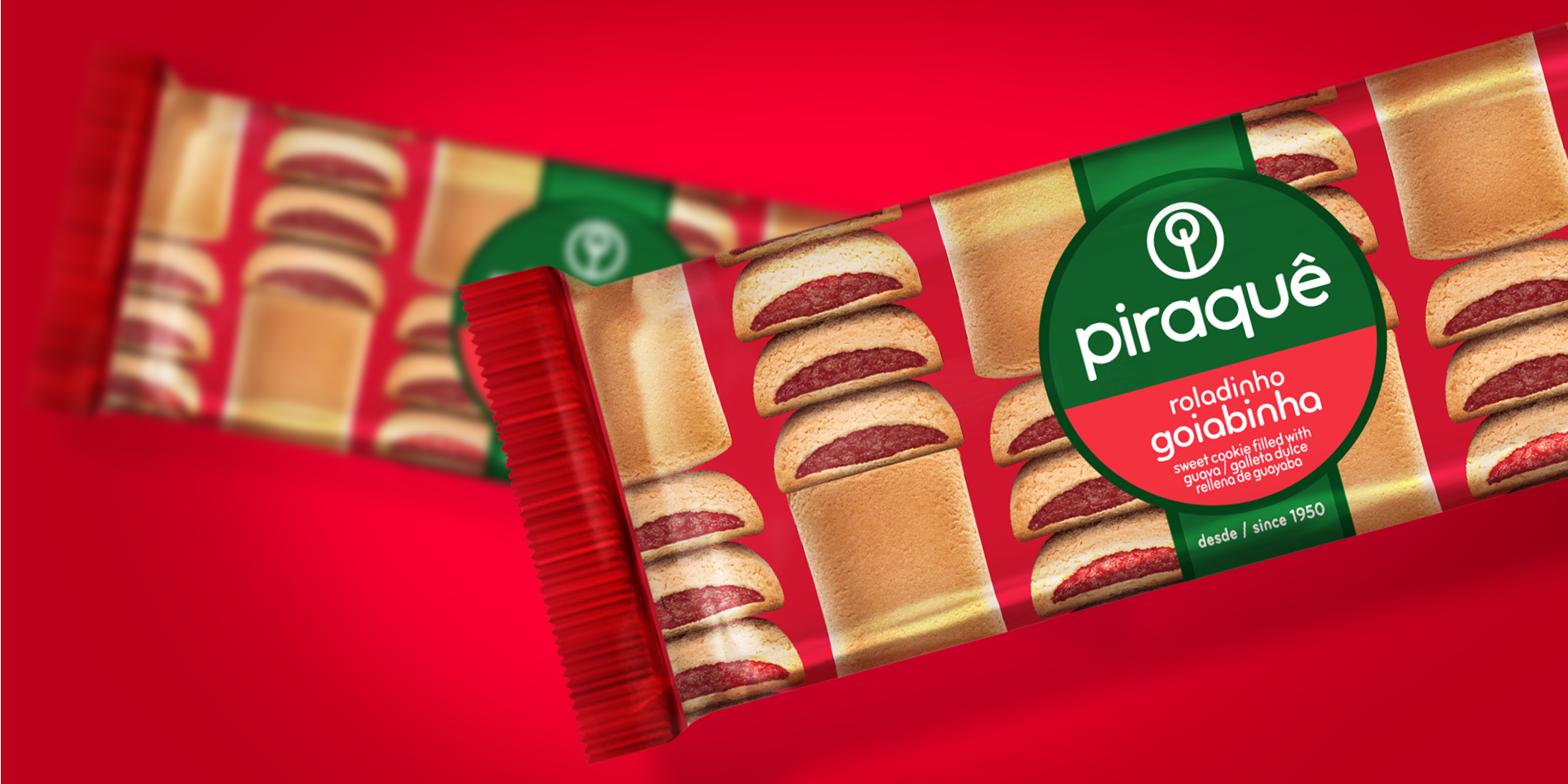
In our investigation, we studied the atmosphere of the factory, Rio de Janeiro and the history of Piraque packaging, rescuing repetition as the brand's patrimony, something so exclusive and original, that in its segment only Piraque could use it. We chose green as the official color, avoiding the red codes of the industrial category. We redesigned the brand using the biscuit as a starting point to structure the new logo. We aligned institutional communication and redesigned the entire packaging architecture with more than 200 products, and the logo became a seal on the packaging to wrap the product.
Result
Piraquê's identity has been modernized, maintaining the tradition and quality for which it is already recognized, being able to build a proprietary territory and strengthen the union of the entire portfolio. His new identity also guaranteed the visibility that culminated in the billionaire purchase of Piraquê by M. Dias Branco, national leader in the manufacture and Sales of cookies and pasta.